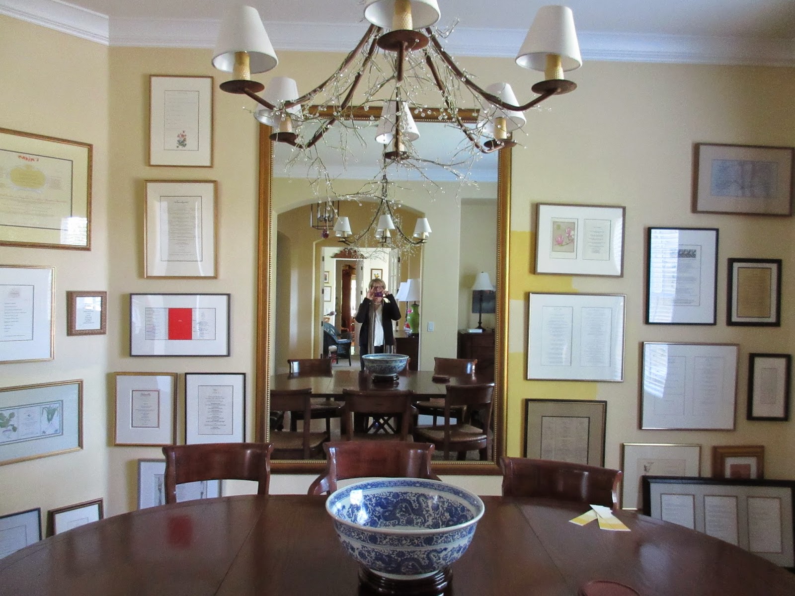
At first I thought I'd made a big mistake - like the time I wanted to paint our living room the color of a chamois, and it ended up looking like a 70's era Harvest Gold Sears refrigerator...and then I panicked and chose a yellow so pale it looked like an old lady's bedroom. Oops. You don't want to know what it took to set that to rights.
So, older and wiser (or so I thought), I painted BIG swatches of several colors. Swathes, really. And I chose the brighter color. Strong person, bold color.
Cutting in it looked all right...
And when I rolled the walls the wet paint was the color of mangoes and cream. Yummy.
And then it dried. Oops. The next morning I hied it down to the paint store and bought the next color down...except it wasn't. The chip I chose from and the chip they mixed from had the same name, but not the same color. After some kerfuffle they agreed, and went thru several gallons and three days (at their expense) to get the color perfect.
I painted a big swath of the new color, right next to the mirror...too pale. Rats. So I got out the roller and brush, said a little prayer, and put on a second coat. Of the bright color. Knowing that we had black and white menus (framed in black and gold) that would cover lots of the wall helped me breathe. Black and white make this color pop. And knowing that it's just paint helped too, but by this time I was feeling quite attached to the saffron glow, and hoping the saffron crush lasted.
I learned something about deep colors - pale when wet and just out of the can, they dry dark at first and then lighten as they cure.
It glows in the light coming in the window - I keep going into the dining room to turn out the light...which isn't on.
My incredibly talented friend Cathy came over and helped me hang the menus. I had hung most of them as they came from the framer (our wonderful fabulous framer, Aletha. Studio Frameworks. The Best. Use no other.) But they were hap-hazard, and a bit awkward as you can see...
Actually Cathy gave me a master class in picture hanging (move over, Mario Buatta!). And in line and color, form and harmony, unity, balance and scale. I learned more from Cathy Friday afternoon than I did in 5 years of design college. And it looks incredible. I find myself drifting into the room, smiling, sitting down.
It's a hit with our friends too. We had a dinner party last night and we had so much fun! So if you're looking for something to make you smile, try a bold color. And an afternoon with a wonderful and talented friend. Thank you Cathy.


No comments:
Post a Comment